If there’s one thing you get out of this post, let it be this: Brand visuals are about so much more than meets the eye!
Brand visuals are incredibly important, especially considering the average person believes brand visuals is all there is to branding. However, it’s more about the thoughts and feelings the visuals evoke than the visuals themselves.
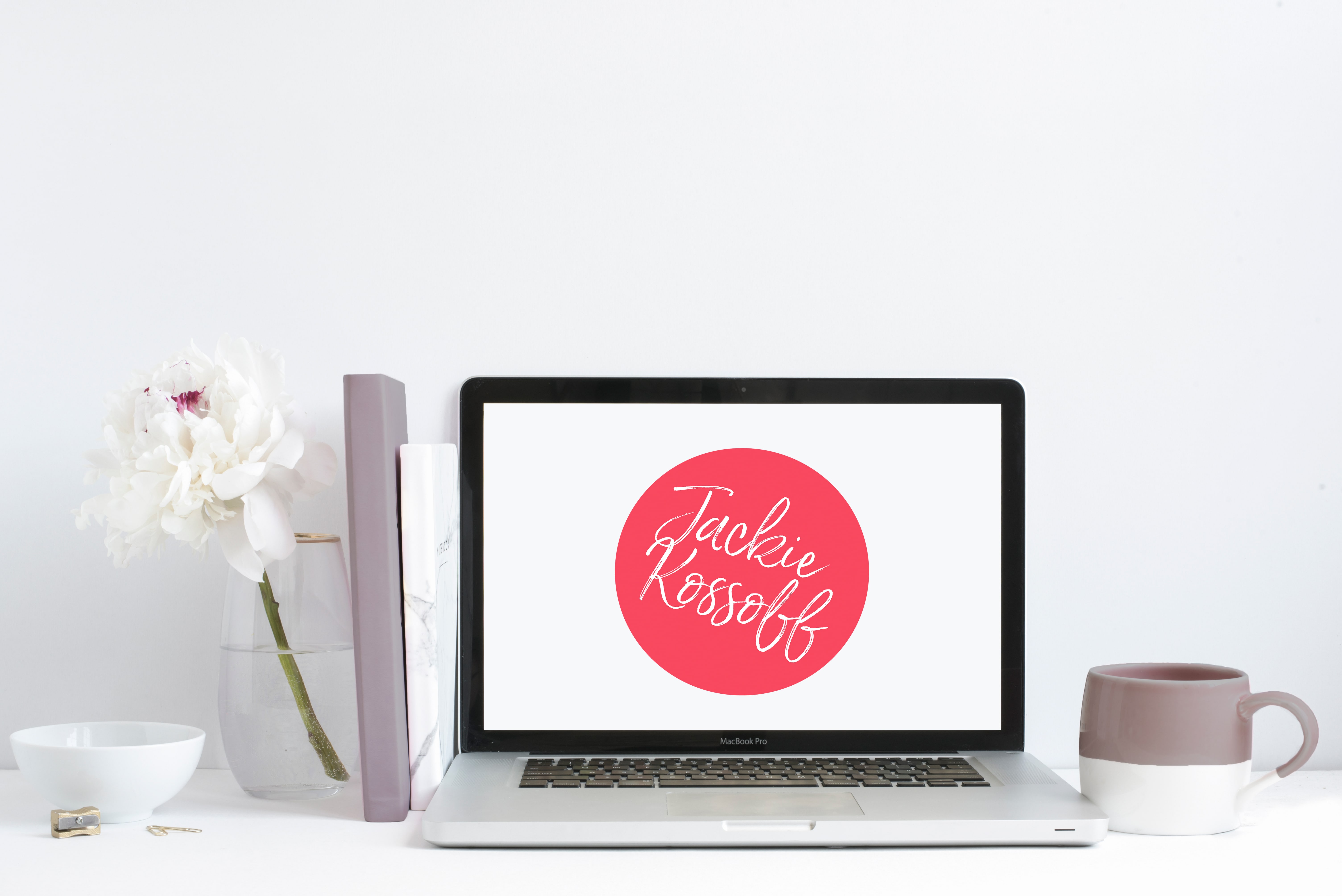
Allow me to us my brand visuals as an example. Visually speaking, the light red–almost pink–of my logo contrasts nicely with the white and gray accents of my brand materials. My logo font is brush script, but easy to read Aesthetically, it’s simple and pleasing to the eye. However, beneath the surface it’s also meant to evoke a sense of female empowerment. I created my brand to appeal to women entrepreneurs who wanted to feel empowered by their marketing, not drained or helpless. At the same time, the main color is close enough to red to also hold a certain appeal to most men–or at least according to the color theory chart (my male clients also don’t seem to mind). 
The main exercise I advise my clients to complete when they are searching for their brand colors is to think of three keywords they want their ideal clients to associate with their brand. Then they can select their colors, fonts, photos, etc. accordingly so their brand evokes those three key associations. My brand’s three key associations are Empowerment, Excitement, and Excellence!
Note: You do not need to choose alliterative association words, but once I had the first two, I knew I was going to find another “E” word!
In terms of fonts, my main concern would be READABILITY! You can have the fanciest font on the planet, but if no one can read it, your business will suffer. If you’re unsure if a font is “too fancy,” ask five people for feedback.
I’m going to spend an entire post on brand photography, so look out for that one too!